AOL / GDGT
Fifty routers on a shelf, one nervous parent — and a brief with almost no information.
AOL handed me this as a hiring exercise for its gdgt and Engadget properties, and I’m framing it honestly as one. The value on display isn’t a launch or a metric — it’s how I made concrete decisions on a deliberately vague brief with no one to ask for clarification. That constraint is the whole case study.
A single paragraph — and the ambiguity was the point.
The brief: a companion app with one purpose — help someone shopping for a consumer-electronics product make an educated buying decision, harnessing the rich product data from Engadget and gdgt. The scenario that anchored it: a smartphone-owning parent walks into Best Buy with no idea which router to buy, and there are fifty to choose from.
Define, ask, synthesize — reasoning, not pretty comps.
Rather than jump to screens, I organized the whole response around an explicit three-step process and presented it that way — because with a vague brief, the reasoning path is the deliverable.
Define the problem
What don’t we know that we need to know to move forward?
Ask the questions
What can I ask to get the answers I need?
Synthesize
What do I do with what I’ve learned?
What does a nervous shopper actually reach for?
I couldn’t run a study, so I answered from what I already had — a working mental model of non-technical shoppers from an earlier e-commerce launch. Three things the app had to make effortless became my guiding principles, and every screen had to earn its place against them:
Not search-one-at-a-time — guided entry points.
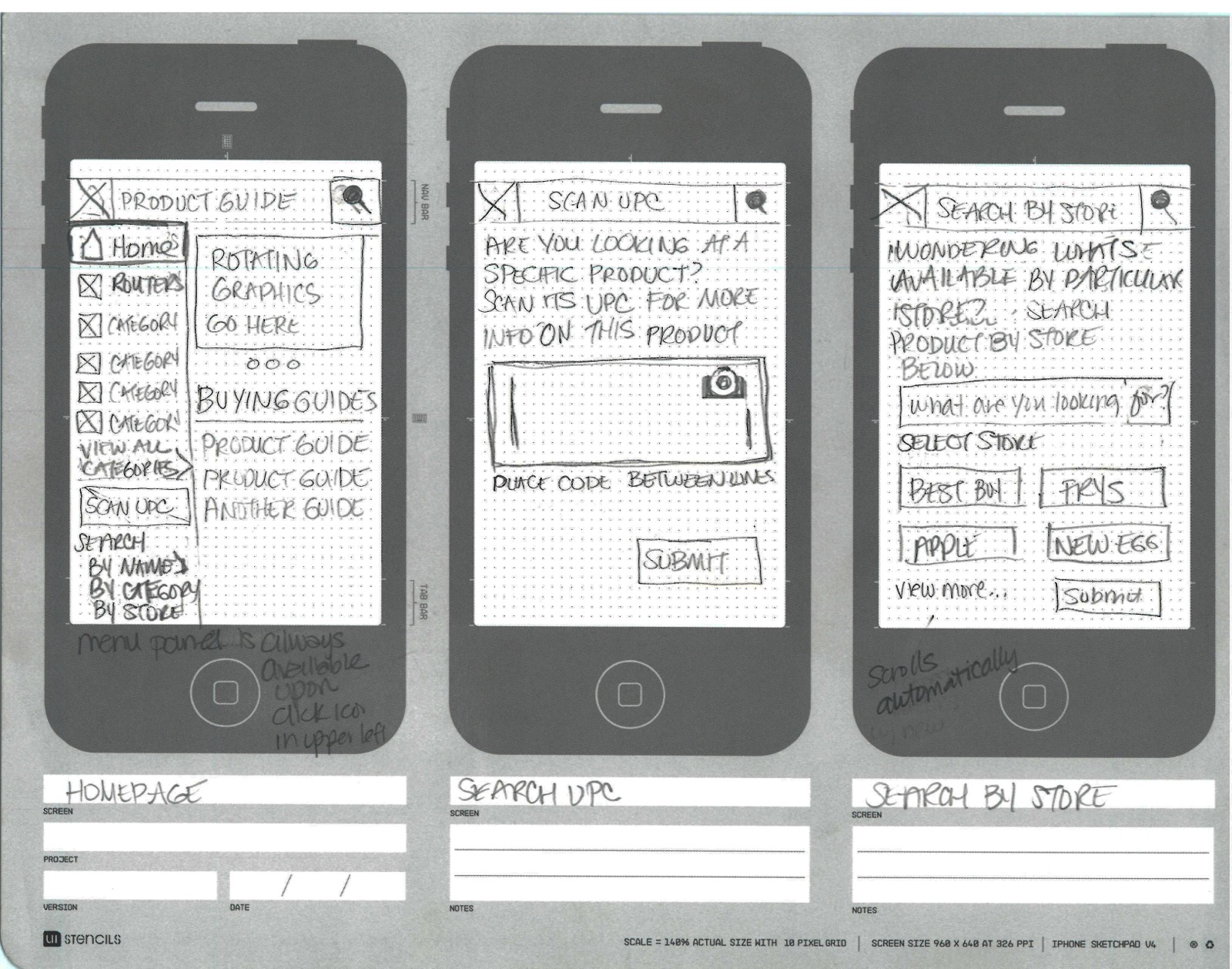
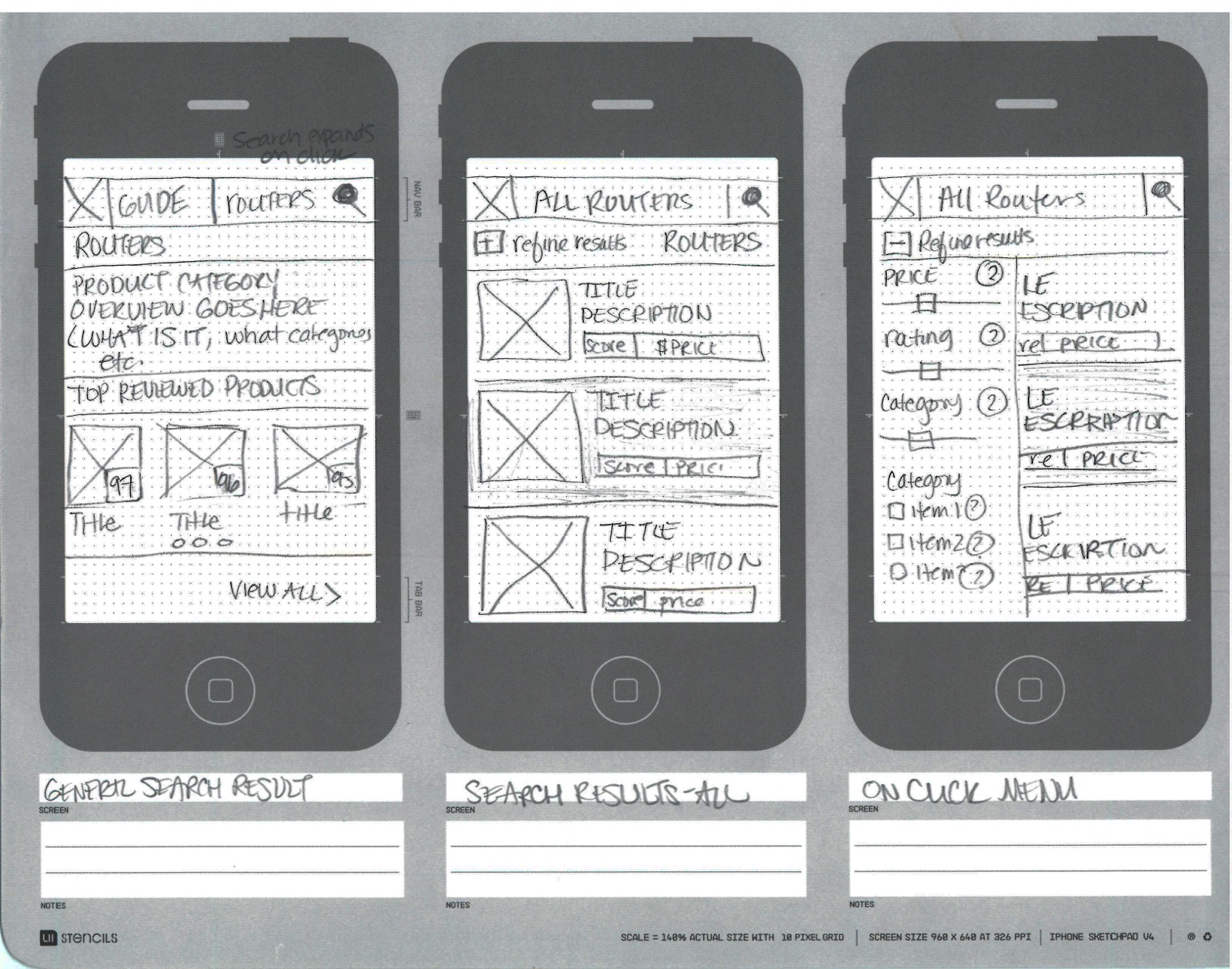
My first instinct — search and click through products one at a time — I rejected fast: for someone staring at fifty routers, that’s exactly the intimidating experience the brief was trying to fix. So I pivoted to guided entry points that meet the shopper where they physically stand: a curated Product Guide, a Scan UPC that points the camera at the box in your hand, and Search by Storeso you only see what’s carriable where you are.
Scan UPC collapses the gap between the physical shelf and the digital data — the real friction in the scenario.
Serve the primary user without amputating the power user.
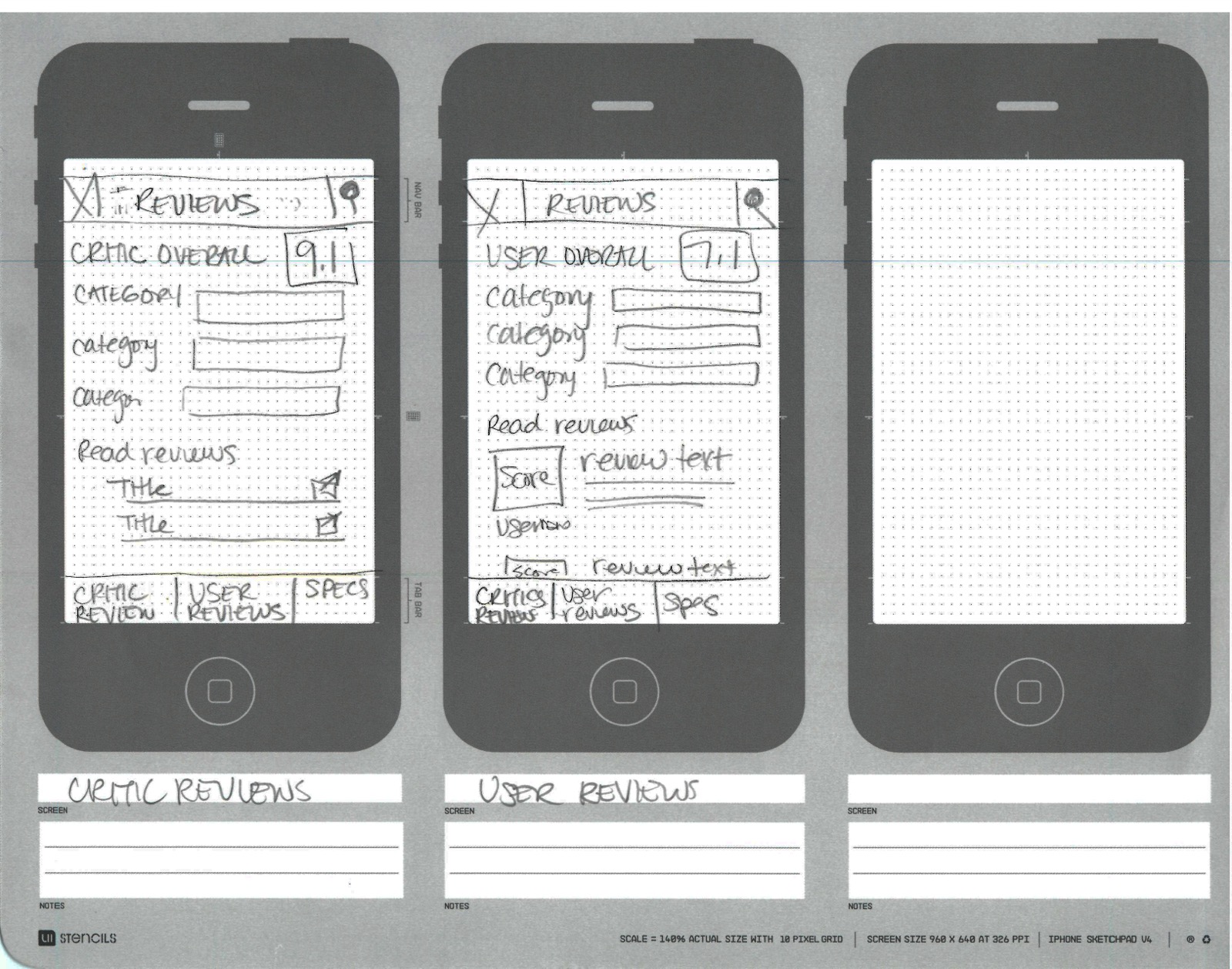
The product detail page was built around the thing gdgt and Engadget do best — reviews and specs. I split it into critic reviews (an overall score, per-category breakdowns) and user reviews (a separate overall, plus readable text), with a full-specs tab underneath. The non-techie shopper gets a trustworthy score at a glance; the spec-hungry shopper can still dig.
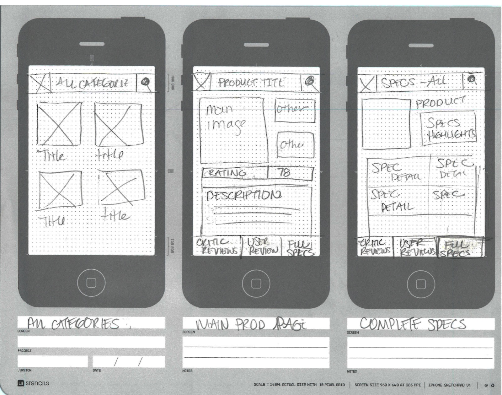
The same layered detail page in context — category grid in, product page, and the full-specs tab that lets the power user dig past the review scores above.
Where the reasoning landed.
The sketches resolved into one styled home screen: a scannable Product Guide with category shortcuts, buying guides, and four ways in — search by name, category, store, or location — with the barcode scan kept front and center. The hierarchy the sketches argued for, made real.
Stating your assumptions out loud is a design skill in its own right.
The output was a full sketched concept, with every assumption I made written down and handed to the hiring manager alongside it — because making them explicit wasthe deliverable. The brief was vague on purpose; the answer wasn’t to guess the hidden intent, but to reason from what I knew, commit to a point of view, and make that reasoning legible enough for someone to challenge.
Honest framing: this was a hiring exercise, not a shipped product — there’s no launch or metric, and I won’t dress it up as one.