Enhancing the
Quality Platform
The flagship quality tool worked — but no one could get through it. I had three months to change the trajectory.
iTradeNetwork — supply-chain SaaS for retail & foodservice
UX Consultant — first UX hire at the company
UX strategy · requirements & use cases · stakeholder facilitation · paper & Axure prototyping · usability test planning
The features worked. People couldn’t.
iTradeNetwork’s flagship Quality Management System is where buyers and suppliers manage perishable goods moving through the chain. The capability was fine. Users just couldn’t get through the interface — and every stumble turned into a support ticket.
Users routinely failed tasks they came to the platform to do.
Every failure became a support ticket — a high-touch crutch.
One flow, chosen on purpose: the complaint process.
The most-used part of the Quality Platform, and — not coincidentally — the most problematic. If any single path was generating the support calls, it was this one. So it became the spine of the redesign.
Two KPIs, one root cause.
The business wanted two things, and they were tied together. Both move the same way when people can complete their work without calling for help.
Fewer support calls. Cut the volume of customer-service calls the platform generated.
Higher satisfaction. Raise customer satisfaction as people got through their work.
First UX hire. And a bridge, not a resident.
The previous designer had just left; a two-person design team was about to start. I was hired to keep the work moving in the gap — and to hand those new designers a direction solid enough that they wouldn’t start from a blank page.
Diagnose the real problem and sketch a defensible direction for the core flow.
Educate the org on UX process and organize cross-platform teams across product, dev & business.
Time. Weeks, not quarters — I had to be ruthless about what was worth doing in the window.
Keep the underlying functionality largely as-is.
The interaction layer, where the friction actually lived.
No time for a research program. So I triangulated.
Three imperfect sources, read together, pointed the same direction.
This was signal from support calls, not formal user feedback. I designed knowing that.
Customer-service data
The record of what people actually called in about — my primary signal.
Client-facing teammates
The people who talked to clients daily and could tell me where users got stuck.
The departing designer
What I could reconstruct from whoever had just left the role.
Traded fidelity for speed — on purpose.
Polished mockups would have burned the runway and handed the next team something too finished to question. So I worked in sketches and paper prototypes — with the onsite developers close at hand.
An agile back-and-forth, testing whether an idea was buildable in a hallway conversation instead of a spec. It let me work through several ideas for streamlining, fast.
The new designers could see the why— the reasoning — not just a finished-looking result they couldn’t easily change.
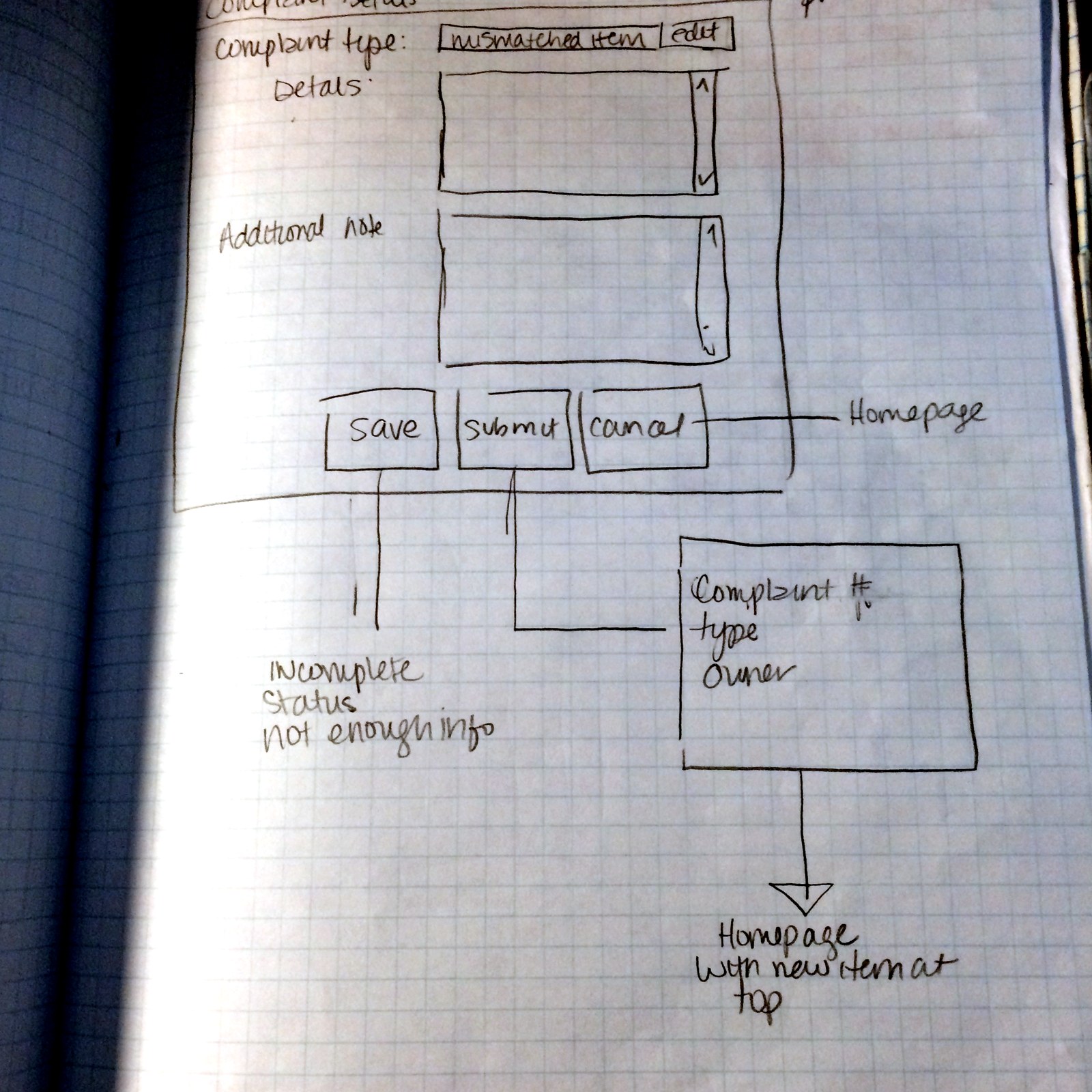
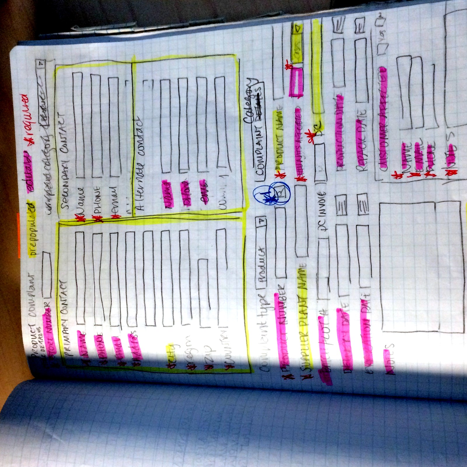
The worst offender for wasted steps.
The fields they still fill in — organized around how a chef or shop manager actually thinks about a bad shipment:
Structured around the real decisions in each screen.
Complaint details
A clean save / submit / cancel model, with an explicit “incomplete — not enough info” state instead of failing silently.
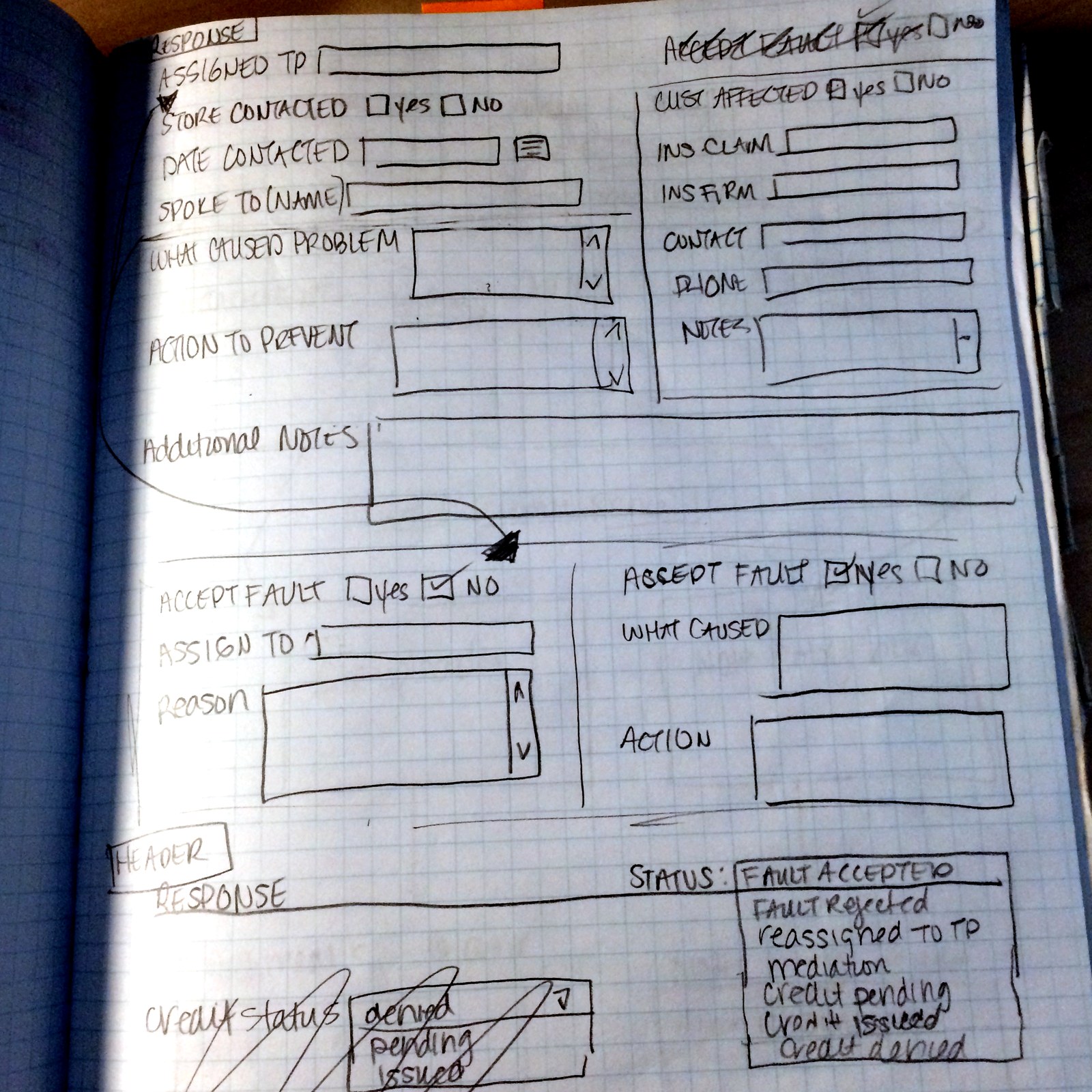

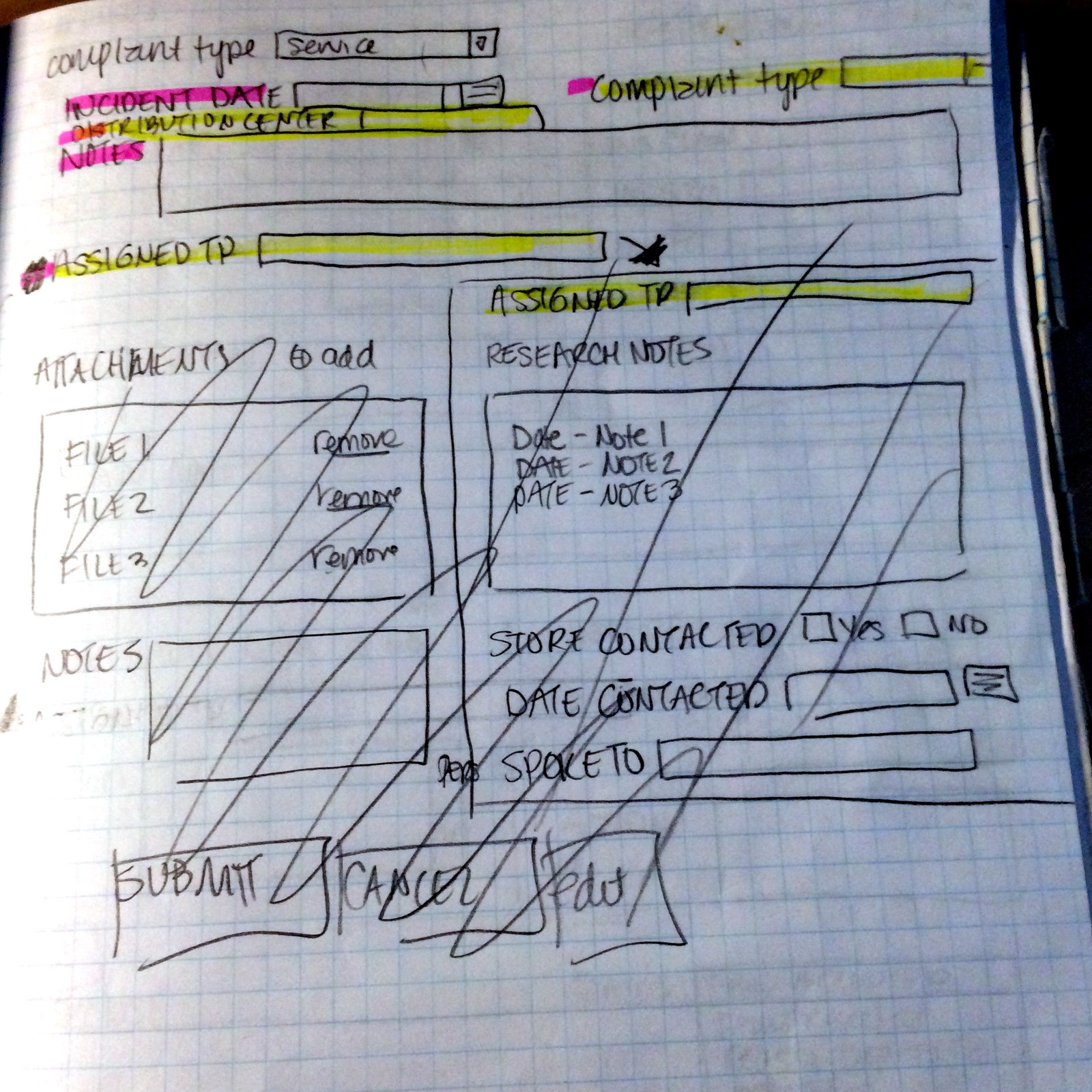
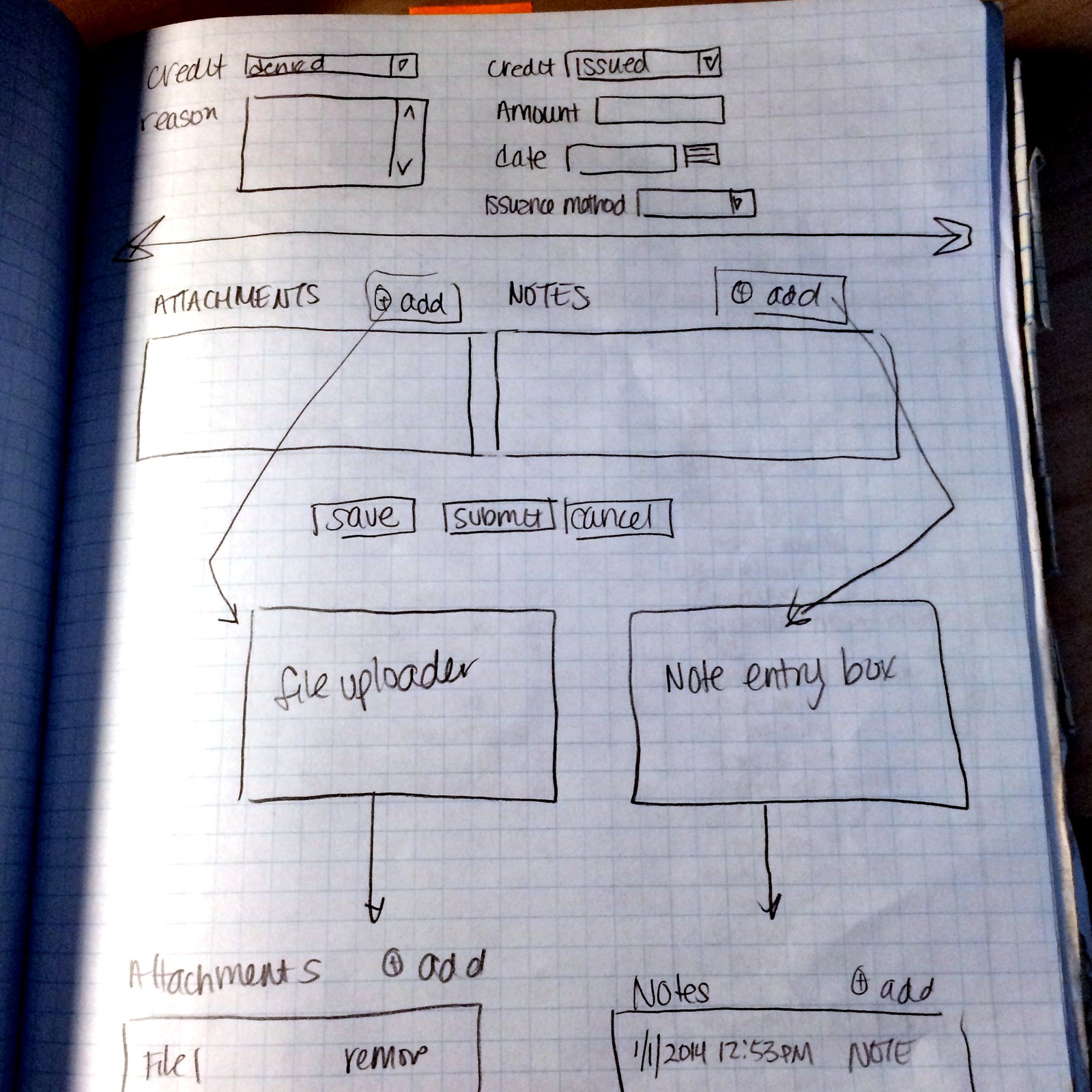
Response & resolution
Assigned-to, accept-fault, and the credit path — denied / pending / issued— plus attachments and notes, rolling up to one clear status.
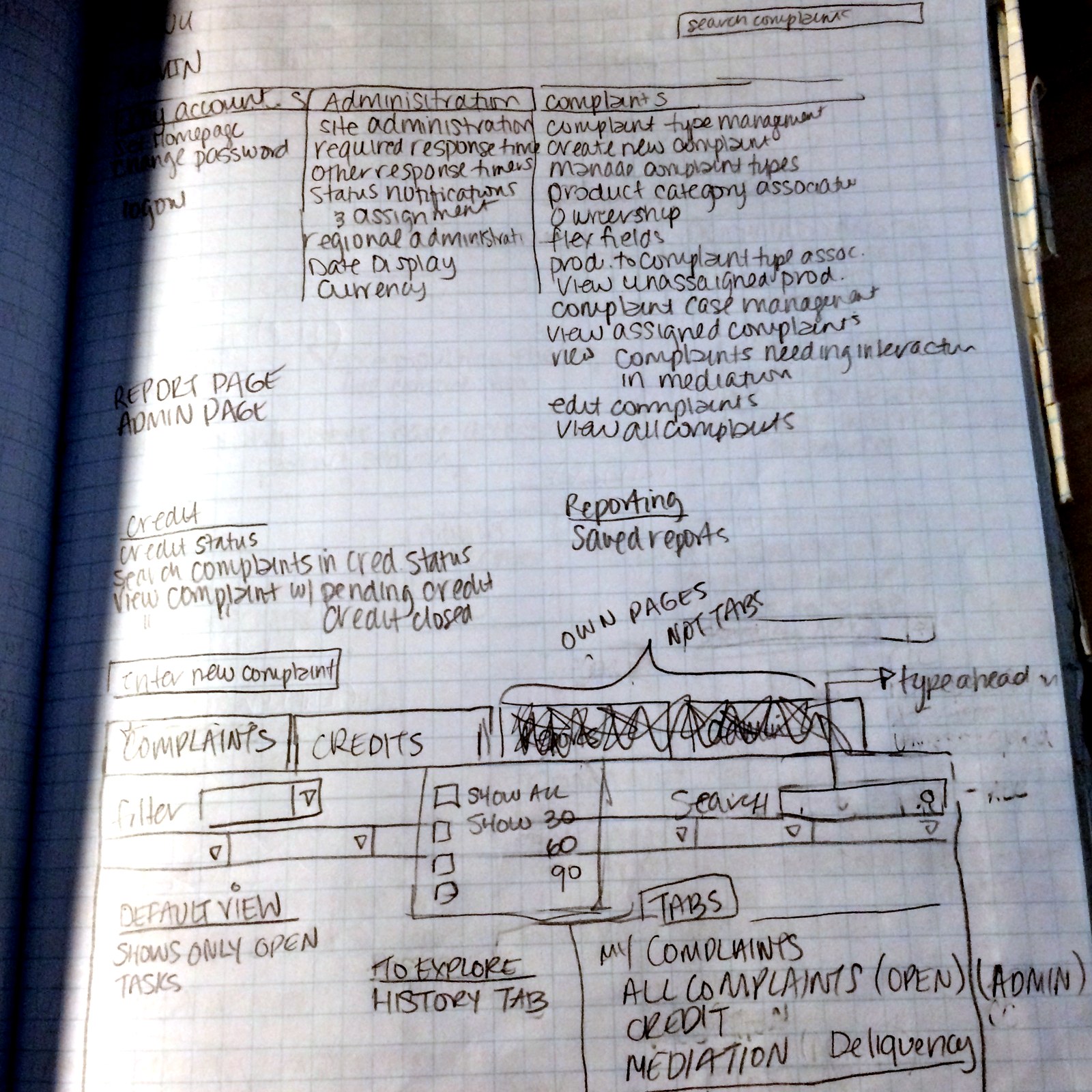
Complaint list
A filterable table with saved views and task-oriented tabs.
Clarity — and the work that makes it stick.
Simplify the key actions so a task could be completed without a training call — and set a cleaner approach for how new features get introduced, so the product wouldn’t slide back into complexity.
Led initial gathering from key clients and prospects.
Wrote the initial use cases for the core flow.
Built responsive Axure prototypes where fidelity was warranted.
Stood up a usability test plan the next team could run.
The idea was never to ship a finished redesign in three months. It was a well-reasoned concept the team could carry forward, pressure-test, and build.
No number to claim. A handoff I’d stand behind.
I left as the new team arrived, so the concepts weren’t validated by user testingbefore my departure — that was, by design, their next step. There’s no support-call or CSAT number I can honestly claim as mine.
- ▸A diagnosis of the real problem— interaction complexity, not missing function.
- ▸Worked-through concepts for streamlining the core flows.
- ▸Initial use cases and requirements from actual clients.
- ▸Cross-platform teams organized to support the work.
- ▸A usability test plan ready to validate the direction.
For a company that had never had UX, that was the difference between the new hires starting cold and starting with momentum.
A designer’s job includes naming the gap.
Rushing doesn’t produce good work. When you lack the time, tools, or research access to finish something properly, the responsible thing is to say so — out loud, early — and leave behind the plan to close it. Flagging that the concepts still needed validation, and building the test plan to make that easy, was as much a part of doing this right as any sketch I drew.